Sony Ericsson P1

Even though it carries a 'P' designation, the new Sony Ericsson P1 shares far more of its physical design with the Sony Ericsson M600 than it does with other P-series devices like the P990. In general, the P1 can be thought of as an M600 that was given an improved keyboard, WiFi, and an auto-focus camera on the back. Indeed, the P1's 106mm x 55mm x 17mm (4.1" x 2.2" x .7") dimensions and 129g (4.5oz) weight make it a very pocketable device in spite of its capabilities.

The front of the P1 consists solely of the 2.6" TFT display and the QWERTY keyboard. The display is reasonably bright and crisp, but seems to lack some of the visual pop that I've seen on many other recent QVGA (240x320 pixel) displays. The surface of the display sits a few millimeters below the face of the phone, as is the case with 95% of the touchscreen devices on the market today. This makes it more difficult to clean than devices such as the HTC Touch and Sony Ericsson's own W960, which use flush mounted displays. This sunken nature of the display is all the more obvious to users because of the P1's lack of hardware softkeys. Instead, the P1's Symbian OS and UIQ 3 user interface rely solely on on-screen softkeys along the bottom of the display. Other on-screen controls are mostly intended to be accessed via the scroll wheel or the included stylus The stylus itself is very thin, which some people dislike. It is, however, a respectable 95mm (3.75") in length.

The QWERTY keyboard on the P1 is unusual in that the right and left edge of each convex shaped key serves a different purpose. As such, the 'A' and 'S' letters are on the same key instead of on neighboring keys. The shift key located in the bottom left corner of the keypad works as one would expect, and the ALT key, in the lower right hand corner of the keypad, is used for accessing the numeric keypad digits and symbols. A pair of arrow keys straddle the space bar, and they offer a bit of help when navigating the P1 without using the stylus. The number keys, when used with the ALT key (which can be locked on), work like they do on regular phones in that you don't have to worry about the edges, you just press the key. The design is compact, but far from ideal. A year ago when I reviewed the M600, I adapted to its keyboard and learned to live with it. But now, after having been spoiled by many devices with fine QWERTY keyboards, I am less inclined to embrace it. Those extra few millimeters of width offered by the keyboards on devices like the Motorola Q or Palm Treos make a big difference. The P1's keyboard is certainly passable for those that value a compact form factor over ease, and speed, of use - but it is not one that I am in love with. In any event, the keyboard is faster and easier to use than the touchscreen based virtual keyboard or handwriting recognition system.

Nokia's 6110 Navigator GPS Phone

After long being focused on bar-style devices, we are seeing more and more sliders from the Finish manufacturer of late, and the 6110 is one of the finest examples of the form factor I have seen from Nokia. Everything about the Nokia 6110 feels solid and durable, though the gloss black plastic used has a very unfortunate cheap feel to it. Offsetting this is a lovely brushed aluminum finished area on the front, silver sides, and a chrome camera cover. I am also very happy to see the use of plastic doors over the memory card slot and miniUSB connector.

The front of the device holds the two softkeys, call, and end keys, which surround a large 5-way d-pad. Directly underneath this the clear key, menu key, and a shortcut button to the navigation application can be found. All these keys are stylishly flush mounted to the face of the device, though they are still surprisingly comfortable and easy to find and use. Also surprising is the use of the end call button as the power key when we are used to seeing Nokia handsets with a dedicated power button.

Opening the slider reveals a keypad not completely dissimilar to the one used on the Nokia N95, though it is a little smaller. While the keys are adequately spaced for easy usage, tactile feedback is atrocious. The keys are far too firm to be used comfortably for anything more than quickly dialing phone numbers, meaning that frequent text message users may have to look elsewhere. The top row of the keypad is also far too close to the upper part of the slide, and the large step up makes them very hard to press for all but those with the smallest of fingers.

Looking to the right side of the Nokia 6110, you will find the volume up and down buttons and a camera shutter key, with the miniUSB connector, a personal shortcut button, and the microSD slot housed on the left. All the buttons on the device continue the flush design seen on the d-pad, and while a very small travel distance and light detailing may hinder the ability to find the keys blindly, it ensures that when used with the bundled car mount none of the keys are pressed inadvertently. The battery cover release is found on the bottom of the device, and in a move that leaves me completely puzzled, the charging port and 2.5mm headset connector appear on the top. While this may make sense for the 2.5mm jack, this positioning of the charging port makes both desktop charging and charging off a car's cigarette lighter while held in the car mount extremely inconvenient. On the back of the device, a chrome lens cover protects the 2.0MP camera. The large speaker is found directly below.

While it is much smaller than the N95's, the Nokia 6110 Navigator's screen carries the same QVGA resolution, and is one of the best I have seen on a Nokia device. As the handset will more than likely be used for navigation while attached to the windscreen of a car, usability in direct sunlight is of paramount importance. This, thankfully, is one of the 6110's plus points. Even in sunlight, the screen holds good contrast levels, and colors continue to appear quite rich. While a bigger screen would obviously be a boon for a device like this, I found it more than adequate in testing. Usage out of sunlight is great as well, with on-screen text and graphics being very crisp and clear. Small compass point detailing around the screen continues the navigator theme.

Motorola RAZR2 V9m for Sprint

While it shares its lineage with the famed RAZR models of the past few years, the new Motorola RAZR2 V9m is a completely different device. It is better looking and more solidly, as well as thoughtfully, designed. The 120g (4.2oz) phone has many lovely details on it, including etched buttons that look quite pretty on the gnarled sides of the lower half of the clamshell. The rear of the device uses a new flush mounted battery cover that is coated with Motorola's grippy soft touch paint. The loudspeaker is located on the very bottom of the device, in the same 'chin' that is the home of the built-in antenna. The speaker has ports on the back and slanted bottom of the RAZR2, which helps ensure that it is unobstructed.

The front of the device, when closed, is where the new 2", QVGA resolution 65k color external display is located, directly beneath the lens for the 2 megapixel camera. The external display is huge when compared with most other handsets on the market. Its 3 touch sensitive buttons that are used in conjunction with the volume and smartkey buttons on the left edge of the phone allow users to control many features with the phone closed, including music playback and the Sprint TV service. The touch buttons are very easy to use thanks to vibration haptic feedback when they are pressed, but the display itself is lacking in color saturation. It is worth noting that the camera, smartkey, and volume buttons located on the edge of the V9m also provide vibration feedback when pressed.

Opening up the V9m reveals the large main QVGA resolution display, the flat RAZR-style keypad, and the massive metal hinge that is located between them. The main 2.2" display is capable of the same 65k colors as the external display, but it is far brighter and colorful. The display really shows off the improved look of the device's user interface. The keypad will be familiar to anybody who has used a RAZR or one of the many RAZR-clones on the market: it consists of a single flat metal panel with slightly raised rubber key separators. It works very well in spite of its ultra-thin design. Located above the alphanumeric keys are the two softkeys, dedicated back and speakerphone buttons, the green and red call controls keys, and a perfectly flat, 5-way d-pad controller. All work very well.

The large metal hinge in the middle of the device is one of the reasons that the RAZR2 design is so tough. I've seen Motorola reps slam them on tables, and had been told that they had even contemplated making a climbing wall out of them to demonstrate their strength. That same hinge, along with the V9's 103mm x 53mm x 12mm (4.1" x 2.1" x .47") dimensions, also make it a bit top heavy when opened up. The fairly strong spring in the hinge seems to slam the phone closed a bit harder than I would normally think prudent. The top of the flip appears to miss the thin rubber bumper that is located below the keypad during closing, which might account for the sense one gets that the phone is slamming shut. In any case, it certainly seems tough enough to take it.

Helio Fin by Samsung

It seems Helio has orchestrated yet another collaboration with Korean phone manufacturer Samsung. Helio, already boasting two Samsung sliders in its portfolio, the Drift and the Heat, is trying to maintain its cutting edge reputation when it comes to its devices. Changing things up a bit this time, Helio has introduced a flip style handset, the Samsung Fin.

This good looking and extremely thin (12mm/0.5") 3G handset has very sharp angles and attractive lines. The Fin's magnesium body is draped in a dark blue hue throughout, though Helio's TV and print advertisements for the Fin tend to make it look a bit lighter and bluer in color than it really is. Though thin, the Fin's grippy edges make it easy to hold onto even when opened. The Fin is solidly built with a sturdy flip top that seems to have no play or sway - definitely a design that should be able to endure everyday use.

On the outside of the Fin is where you will find the phone's extremely small external display, a 16 character OLED screen that sits high on the flip's front, just below the lens of the 3 megapixel camera. This tiny display provides indicators for signal strength, messages, ringer status, battery life, and time. When in direct sunlight, the external display is basically useless. It should be noted that when the phone sits idle, the external screen shows its status icons, but not the time – something that left me perplexed. To alleviate this problem, I configured an hourly voice alert that announces the time. Flipping the device over to the back, one finds the release for the rear cover, something that has to be removed to swap batteries or memory cards. The Fin can handle up to 4GB microSD cards but does require battery removal for swapping. The outside of the Fin is almost barren except for its left edge, which is where the tiny volume rocker and covered charging/headset port are found.

Flipping open the Fin exposes the large and brightly colored 2.3" 262k color TFT QVGA (240x320 pixel) resolution screen, which we found extremely easy to read in even the harshest of sunlight. The device's speaker is located just above the display, which, interestingly enough, uses a pass thru port located on the Fin's prominent chin to allow ringtone audio to be heard when the phone is closed. Very clever. The chin of the Fin also is where the handset's microphone is housed, along with the internal antenna. The fin sports a flush-mounted, membrane keyboard that can be difficult to use blindly since there are no finger guides or ridges to work with. The keys offer decent tactile feedback, but have a very limited range of motion that is less than optimal. Samsung and Helio went with a cool rectangular shaped silver d-pad that definitely attracts attention. The d-pad's center button is accentuated with Helio's logo, which I often press by accident when I wish to access the main menu. Instead, Helio has assigned the left softkey for this task and the right softkey for Contacts. Clearly defined Music, Camera, Back, Send, and End buttons are also found on the Fin's keypad.

The Helio Fin runs on Sprint's CDMA voice network and uses EV-DO for high speed 3G data. The Fin provided us with great reception and coverage, never dropping a call. Voice clarity and quality always seemed good during phone calls, even when using it with a Jabra JX-10 Bluetooth headset. The speakerphone, though, is only usable at very close range, lacking the ability to pump out enough volume even at its maximum setting. I was even more discouraged with the speakerphone when testing Helio's latest addition to its application lineup, Garmin Mobile. The navigation app worked wonderfully except for the awful speach quality it produced due to the poor speakerphone. The Garmin Mobile navigation service can be accessed for US$2.99 per day - once the software has been installed.

Similar to Helio devices of the past, the Fin has an endless supply of apps and multimedia that include video and music downloads. Downloads are not the cheapest on the market, but with a good 3G connection you will be off and running in no time. The Fin's music player can be launched quickly via its dedicated shortcut key or via the Helio menu. Helio does a fantastic job here by sorting music files by playlists, genre, artist, album, and song. The only nit to pick is the music is alphabetically categorized. What this means is when an album is played, tracks will be played in alphabetical order instead of track number order. Another shortcoming is the Fin's inability to multi-task musically - music can not be played while other parts of the device are used. On the plus side, the Fin supports Bluetooth stereo, which we took full advantage of. It proved wholly adequate when used with our Motorola S9 headphones.

Sony Ericsson T650

The release of the Sony Ericsson T650 signifies two things: first, the revival of the T series, and secondly, an indication of the company's first step into the fashion world. By definition the T650 is built for anesthetic viewing pleasure, not simply for the music or the camera. It is considered to be a mid-range phone that reconciles size, function, and fashion. Today we will see if it can really make you look good, or if the user will be left feeling like a fashion victim.

From the color to the overall design, it is obvious that Sony Ericsson is trying to be different. The green is a Growing Green we have never seen on a phone before, and that Midnight Blue is pretty much the darkest blue in the market. However, with all that we cannot help but relate this model to their bestselling T610 from some four years ago. The most striking feature at first glance is perhaps the brushed metallic housing that frames the screen. The metal also extends around the back, making the design more consistent. The camera, along with its LED flash, can be found on the back of the phone. It is a bit worrying that the camera actually protrudes a bit out from the body, making it prone to scratching.

The d-pad controller and the number keys are square in shape, whereas the two softkeys are constructed from metal plates that match the metal parts of the T650's cover. Conversely the back and cancel buttons, along with the adjacent shortcut keys, are blended into the more plastic casing material that constitutes to the lower half of the phone. Fortunately the plastic has a matte texture, something that not only improves that hand's grip on it, but keeps it from looking cheap.

Unsurprisingly the power button is on the top of the device and the camera shutter key and volume keys are on the side, with the power port being found on the other side. All that remains is a lanyard hole on the bottom of the phone. The Memory Stick Micro (M2) slot is actually hidden underneath the battery cover, which is released by a new spring mechanism that feels very sturdy. We were relieved to find that the memory card slot is still on the side, and it does not require you to pull out the battery to swap cards.

The T650 is far from the thinnest candybar phone in the world, but at 12.5mm and packing all those features, few should find cause to complain. The overall size is well controlled at 104mm x 46mm x 12.5mm (4.1" x 1.8" x .5"), and the weight is 95g (3.3oz), making it just slightly lighter than the K750.

So far there is nothing spectacular with the design, but that all changes when you dim the lights. Then the magic begins. The T650i is the first Sony Ericsson phone with keypad illumination effects; not only does it blink, but the light actually follows and synchronizes with the animated wallpapers. For example, if some bubbles are moving down the display's wallpaper, then there will also be streaks of light moving down the keypad. However one would have to accept that the backlight is not too evenly distributed when moving; it is also a pity that these light effects cannot be customized.

Light effects are not only found on the front of the T650, but also visible on the back as a message indicator. When there is a new message, a band of golden yellow light will blaze through the junction of the metallic plate and the plastic, making it look brilliant even from afar. As opposed to the Nokia 6300, this indicator is only used for new messages but not missed calls. It only blinks for a couple of seconds when the message first arrives and stops completely after that. By comparison, the Nokia 6300 continues to flash the new message indicator until the user acknowledges it; this is something I would really like to see Sony Ericsson implement in the future.

Nokia 6500 Slide

The Nokia 6500 Slide is one of two 6500 series devices that were announced side by side back in May of this year. Unlike the very thin and simple 6500 Classic, the 6500 Slide that we are reviewing today has a slider form factor, stainless steel body work, and an auto-focus digital camera that uses Carl Zeiss lenses. We tested a pair of 6500 Slide devices that Nokia supplied us for this review: one a prototype, the other a production unit.

The Nokia 6500 Slide is an attractive looking slider handset that is clad in brushed stainless steel with semi-gloss black plastic highlights. Due in part to its use of stainless steel, the 6500 Slide weighs a fairly hefty 127g (4.5oz) considering its otherwise reasonably compact 97mm x 46.5mm x 12mm (3.8" x 1.8" x .5") dimensions. Opening up the dual-sprung slider mechanism reveals the black plastic keypad and causes the 6500 Slide to grow an additional 30mm (1.2") in length.

Apart from being a bit stiff, the keypad is reasonably well designed. The stainless softkeys, call keys, and d-pad all work very well. The nicely raised edge of the d-pad is easy to find, and its center select button is so large that you would be hard pressed, no pun intended, to miss it. The volume control and the somewhat dodgy two-stage camera shutter key are located on the right side. The camera itself, along with its flash, are located out back. A simple release up top allows for the removal of the rear stainless panel that protects the battery. A mini Nokia charging port and normal 2.5mm headset port flank the new micro-USB data connector that is located on the top of the device. There is no dedicated power key - the red call key is used for powering up and down.

The 6500 Slide's display is capable of showing up to 16 million different color shades. I don't find it to be quite as bright as many other similar displays, though, and easily would have preferred a brighter 65k or 262k color display in its place. In its defense, the display is very easily viewed in direct sunlight since it is transflective. Above the display is a second camera that can be used for 3G video calls, something I was unable to test.

The only other thing worth mentioning is that the stainless steel finish gets very dirty looking, as any busy mom with a stainless fridge can attest to. Otherwise, the 6500's design is good, and the device itself is very solidly built.

Sony Ericsson W580 Walkman Phone

The W580 Walkman phone is one of the few slider form factor devices that Sony Ericsson currently produces. In terms of hardware, this quad-band GSM/EDGE handset and the non-Walkman S500, which was released a month and a half later, are near clones. The W580 gains the advantage of the better music player as well as a built-in pedometer, something we first saw on the W710 last year. With an attractive shape and Sony Ericsson's thoughtful user interface, the W580 appears to have what it takes to be a standout handset in a crowded market.

The W580 is a moderately sized phone. It weighs just a hair over 93g (3.7oz) and measures up at 100mm x 47mm x 15mm (3.9" x 1.9" x .6") in size. That's fairly compact. The 2", 262k color TFT display on the front of the device, though small, is pretty bright and is generally readable in all lighting conditions. The phone's gray plastic cover, with its metallic blue highlights, is quite attractive and stays clean looking. A simple chrome volume control is on the left edge of the W580, the power switch and M2 memory card slot are located on the top, and the fast port data/headset connector is located on the right side. The bottom of the device has a bend to it that houses the internal antenna and adds a nice twist to the design.

While the d-pad and surrounding buttons are accessible at all times, the keypad and the camera stay out of view until the W580 is opened up. The d-pad itself has a pretty nice feel to it, but is hampered a bit by the raised rim that surrounds it. That rim is used by the thumb to open and close the slider mechanism, so I understand why it is there. The softkeys, back and C keys, and the dedicated Walkman and shortcuts keys all work well, though the later two are quite small. Small also describes the alphanumeric keys on the keypad. They have a reasonable feel to them, but the overall design of the keypad is somewhat cramped, though very attractive. At least the keys are backlit properly and are very easy to read. The camera sits behind the W580's display, and is surrounded by the same metallic blue material used elsewhere on the phone. It is cool looking, and quite obvious.

Speaking of cool and obvious, the W580 is equipped with what Sony Ericsson calls light effects. These lights are located behind the W580's softkeys and shine out the sides of the device in various shades and patterns. The lights will tell the W580 user when a call or messaging is arriving, and can be configured to be off, on, or on only when the phone is in silent mode. There are 16 different color patterns that users can chose from.

In addition to the gray with blue color scheme of our review unit, a white with orange version of the W580 is also available. We have also been told to expect a black with orange version to become available starting sometime in October.

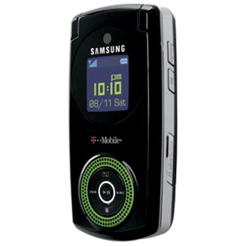
Samsung's Beat for T-Mobile

The most obvious feature on the outside of the Beat is the bright green speaker grille that surrounds a music oriented d-pad controller. The small, square external color display located above the music controls provides status and music player information. It is reasonably bright and colorful. A 'hold' button on the right hand side of the phone can be used to lock or unlock the music controls as well as flip back and forth between the music player screen and the time/signal/battery screen. Also located on the right edge of the phone are the dedicated camera shutter button and the microSD memory card slot. A 1GB card is included in the box, but the slot supports cards of up to 2GB in capacity. On the left hand side are the volume control and the power/headset jack. Both a wired stereo headset and a 3.5mm headphone jack adapter with microphone are included in the box. A USB cable is also included. It can be used for charging or synchronizing music and data with a desktop PC.

The internal display and controls on the T539 are all adequate, but not stellar performers. The TFT display is bright and colorful, but its low resolution and pixelated images remind one of phones from a few years back. It works, but it just looks old-school. The keypad, however, looks quite modern in a Motorola RAZR way. It is a flat membrane keypad. It offers reasonable tactile feedback, but lacks any significant finger guides to aid users when using it without looking at their fingers. A dedicated shortcut key that can be configured by the user is located to the right of the d-pad. That's a good idea.

One of the only real shortcomings with the Samsung Beat that we came across is what appears to be a relatively weak internal antenna. The Beat had some trouble with our less than perfect T-Mobile signal. It failed to find or maintain a connection where most other devices were able to function, even if only poorly. It isn't the worst phone I have tried, by far, but I would have to say it is somewhat below average in terms of reception. The audio quality was very good, however, and even the speakerphone performed acceptably. The Beat's battery managed a decent 5 hours and 40 minutes in our talk time test.

Nokia's Thin 6500 Classic

The Nokia 6500 Classic is one of two handsets in Nokia's 6500 series. Like its brother, the 6500 Slide, the Classic sports an elegant look, quad-band GSM/EDGE and dual-band UMTS support, and the latest version of Nokia's S40 user interface. It is a sharp looking, thin bar handset that can turn a few heads as well as keep its owner's personal music soundtrack playing in the background.

At only 89g (3.1oz) in weight and measuring 110mm x 45mm x 10mm (4.3" 1.8" x .4") in size, the Nokia 6500 Classic is quite a compact little candy bar handset. The Classic's design, reserved and elegant, makes use of simple lines and curved surfaces. The 6500 Classic's 16 million color display may only be 2" in size, but its QVGA resolution makes for some very sharp looking images. The display is also brighter than that found on the 6500 Slide, and is also quite readable even in harsh sunlight conditions.

The small d-pad on the Classic works quite well thanks to its easy to find and raised silver edge that surrounds a large central select button. The two softkeys and the red and green call control keys are also small, but work well. The alphanumeric keypad takes some getting used to, though. The raised silver bars on the keypad separate very small keys. The silver bars can not be pressed, but act as guides for the pad of the fingertip. You can use a fingernail to press the hard and somewhat stiff keys, but most people will find that a fingertip works best. All of the keys and buttons are backlighted well.

Apart from the camera, flash, and speaker on the back of the 6500 Classic, there is little else to talk about. The phone's design is that simple. Charging and USB data connections are handled by the covered micro-USB connector on the top of the device. A small hole on the bottom allows access to the microphone. That's it. The curved sides of the 6500 Classic have no volume or camera shutter keys. Volume is controlled by using the d-pad.

The most interesting physical aspect of the Classic to me is how solid it feels. This phone feels very, very sturdy. It feels like the kind of phone that you could open beer bottles with, or use to break through a car window in an emergency. In fact, when the bottom cover is slid off to expose the battery, the 6500 Classic's metal frame is easily seen. It is a tough little phone, and a pretty one at that.

Samsung's Tiny WEP500 Bluetooth Headset

With its WEP500, Samsung brings the world an even smaller Bluetooth headset than last year's WEP200. Unfortunately, the WEP200 was a device burdened with problems such as echo issues. Well, Samsung is back from the drawing board and this time it has included echo cancellation and noise reduction.

Smaller than before, and certainly stylish, the question remains: Can an even smaller headset be better than the old one? Will it just be a smaller device with the same big problems? Read on to find out.

The first thing you notice about the WEP500 Bluetooth headset is that it's small - really small. The silver and glossy black test unit is about the diameter of a US quarter. The glossy portion shows fingerprints, while the silver area is much more resistant to prints and smudges. Overall the surfaces seem resistant to scratching, as most of the edge surfaces are non-glossy. Should you wish to have a different color, black with a chrome accent will be available from Sprint. AT&T will have the device available in shimmering dark blue. External dimensions are 30mm x 28mm x 8mm (1.2" x 1.1" x .31") and it weighs in at a hardly noticeable 8.5g (.31oz). When paring a device down to this size something has to suffer, and with the WEP500 it is battery life. Samsung reports battery endurance at 80 hours of standby with a talk time of three and a half hours. A full charge was completed in about 2 hours.

Like the WEP200 before it, the WEP500 is an in-ear type design. Again, as with the WEP200, an assortment of rubber earpieces is included to help achieve the best fit. Buttons total three; up and down volume and a multifunction button which I found prone to misapplication.

We received the WEP500 with an array of alternate earpieces in 3 sizes, an AC power transformer and a lidded box for storage which, in similar fashion to the WEP200, serves as a charging dock for the headset. Repositioning the earpiece allows the use of either the left or right ear. The case/charger may be a bit clunky and awkward to use, but it no doubt allowed for a cleaner design. Of at least one free of a charging socket.

Powering up the WEP500 is fairly straightforward: simply press the multifunction button for about 4 seconds until the blue light starts blinking. Turning it off requires a 4 second press of the same button. Pairing is simple as well. From an off state, simply hold the multifunction button until it transitions from blinking to a steady blue. The headset is then discoverable and can be paired using the default code of '0000.' Pairing on multiple devices and 'Headset' and 'Hands Free' profiles are supported. I had no difficulties with my test phones, a Sony Ericsson K750i and an occasionally finicky HP iPaq 6315.

The buttons on the WEP500 are easy to press and convenient to operate. I did however have a problem with the multifunction button which is positioned in a manner that had me inadvertently pressing it a few times while trying to position the headset properly. The good news is this became less of a problem as I learned to avoid it, but I found it to be an occasional problem. Experimenting with the positioning of the earpiece helped with this as well.

A tone on the WEP500 signals an incoming call, a quick tap of the multifunction button allows you to answer, and a sustained press will reject the call if your phone supports the feature. Similarly, a quick press of the multifunction button with no call incoming will redial your last call, while a sustained press will initiate voice-activated calling on supporting phones. A muting feature is present as well; activate and deactivate the microphone with an extended press of either volume button. A quick press of the multifunction button will terminate an active call easily.

Nokia's Updated N95 for North America

The original Nokia N95 was a very high profile handset because it offered most every feature available in a mobile phone at the time: 3G HSDPA connectivity, a 5 megapixel auto-focus camera, a built-in GPS receiver, and 802.11b/g WiFi support. Add to that to a large QVGA display, and a slick dual-slide form factor, and it is pretty easy to understand why it was, and remains, such a big deal.

But in spite of its successes, the N95 suffered from a couple of misses as well. One issue, its lack of battery life due to high-drain components like its GPS and WiFi modules, was an issue for all of the world's markets. Similarly, many users across the globe managed to bump their heads on the somewhat small amount of application RAM on the device. The other lacking for the N95, one which applied only to North American users, was the N95's lack of 3G support for the 850 and 1900MHz network bands. Europeans were able to enjoy the original N95's HSDPA 3G connectivity on the 2100MHz band used in their part of the world.

When Nokia decided to build a North American version of the N95, they took these shortcomings into consideration. For starters, the N95-3 has twice the application RAM that the original had. Meaning that instead of about 20MB of available RAM for running multiple apps, N95-3 users have roughly 80MB of RAM to work with. That's a 4x increase in usable memory from the user's perspective. Nokia also reconfigured the device to use the 850 and 1900MHz 3G bands so that North American users can enjoy HSDPA data speeds on AT&T's network. Sadly, this still won't help T-Mobile USA users when their carrier starts rolling out its own UMTS network next year, but AT&T users can expect to see a real difference compared to the EDGE speeds they were forced to live with before. Our N95-3's HSDPA connection averaged about 500Kbps on the DSLReports.com mobile speed test when transferring 1MB test files. The same test running over our local WiFi network averaged a hair under 2000Kbps, 4 times as fast.

Nokia also tried to address the battery life issues as best they could without changing the physical design of the N95 too much. The technical advances that determine the amount of power that companies can pack into their batteries simply can not keep up with the ever-increasing power drain caused by the new components that people want integrated in their mobiles. If battery technology improves enough to get an additional 10% of power out of the same sized package, you can be sure that the phone designers will add new features that will drain power 20% more quickly. The only way to deal with this problem is to use larger, higher capacity batteries. In the case of the North American N95, the N95-3, this is what Nokia has done.

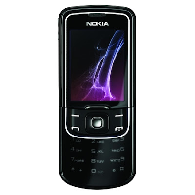
Nokia 8600 Luna

Nokia has always wowed the world with their premium 8000 series of fashion phones, with the new 8600 Luna set to continue the heritage set by its predecessors. It all started with the 8810, a phone entirely clad in chrome, and after going through various materials including titanium, Nokia has again come out shining with the most radical material to grace an 8000 series device – glass. I can imagine thoughts going through your mind, wondering if this is the right move, especially if you are the type of person that drops their phone a lot. While we can't put the 8600 through hell to find its breaking point, Nokia did perform a drop test during the launch of the Luna, with the Luna emerging unscathed. Apart from looking drop-dead gorgeous, let's see if the Luna can function well as a phone.

The Luna comes in an all black color scheme. Any other color and Nokia would have committed fashion suicide. Encased in an all glass front and all steel back, the Luna is a gorgeous phone. The glass front has been made scratch and smudge resistant, ensuring it looks perfect all the time. I even tried using my keys to scratch the glass to no avail. Unfortunately, the matte black steel back of the Luna is not resistant to scratches at all, so users will still have to be careful with where they place the device.

In terms of being a fashion phone, Nokia has nailed it with the ultra glossy Luna. The build quality is top-notch and the spring loaded slider mechanism feels extremely robust. You will need to control the slider a little when closing the phone though, as there is no dampener, making the sliding up and down of the Luna somewhat ungraceful. This is quite unfortunate, and I would have preferred a smooth slow-motion slide mechanism like the one found in the old titanium 8910.

Users can access the d-pad, left and right soft keys, and the call and end keys without sliding open the Luna. This makes it easy to answer calls and read SMS messages without having to open the slide. These keys are quite easy to use and the d-pad is standard fare, offering good tactile feedback. The end key also functions as the power key.

Sliding open the Luna will reveal the white backlit numerical keypad. I found the Luna's keypad to be adequately sized, but it was quite stiff and the lower portion of the slide makes it difficult to press the bottom row of keys. This took some getting use to, and in the end, I found typing on the Luna a little awkward, which slowed down my typing quite a bit.

The design of the Luna is simple: on the left side, you can find the volume keys clad in chrome, along with the left stereo speaker. The right side of the phone houses the other speaker and the microUSB port, which is used for charging, data transfer, and plugging in a headset using the included adaptor. The back of the phone is empty until you slide up the top portion to reveal the 2.0-megapixel camera. This part of the phone is housed in smoked chrome, making it look good but also difficult to keep clean.

Motorola Q 9m

Motorola's first full QWERTY smartphone, the Q, was designed for CDMA networks such as Sprint and Verizon Wireless. The company has since updated the device and labeled it the Motorola Q 9m, and is offering it on Verizon's EV-DO network. Verizon was able to get the device in a sexy black casing with Verizon red trim. The 'm' in the Q 9m's name stands for multimedia, and this device certainly delivers plenty of multimedia experience.

The Motorola Q 9m weighs in at 134g (4.7oz) and measures 117.5mm x 65mm x 15mm (4.6" x 2.6" x .6"). For those paying attention, that's only slightly bigger than the original Motorola Q. However, this device does not look or feel any bigger in person. The Q 9m fits perfectly in one hand, making it extremely easy to use...one-handed. The back of the device is coated in a soft-touch layer that offers plenty of grip without making it difficult to slide into a pocket or the provided protective pouch. The build quality is superb, with absolutely zero creaking or looseness.

The edge of this smartphone is metal and painted Verizon red, while the front and back plates are black. The front of the Q 9m is extremely similar to that of the original Motorola Q, though it has undergone some distinct design improvements. The first of these improvements is the elimination of the empty space between the bottom of the keyboard and the bottom of the phone. The face of the Q 9m is evenly distributed, with the display taking up the top half and the keyboard taking up the bottom half. The d-pad and accompanying keys separate the QWERTY keyboard from the display, and they are nice and big. Surrounding the d-pad are the end/send keys, left and right soft keys, as well as home and back keys. These are separated by a RAZR-like electro-luminescent rubbery lining which glows red when the backlight is active. The d-pad is large and extremely easy to use, with no confusion as to which direction you are pressing.

The QWERTY keyboard is curved slightly upwards on the ends, making it ergonomically pleasurable for your thumbs. The keys are covered in an odd coating similar to the soft-touch of the back of the device that I have never seen used on a phone before. Despite the lack of space between the keys, the Q 9m has arguably one of the best QWERTY keyboards I've ever used on a phone. The keys are domed, making it easy to tell them apart. The bottom row includes shortcut keys for mail, voice command, and Verizon's custom multimedia screen.

The layout of the keyboard, however, could use some improvement. For instance, there is only one shift key, on the left side, and there is no backspace key - users are expected to utilize either the back button up by the d-pad or the one located on the side of the Q 9m, by the scroll wheel. Also, the location of some of the punctuation seemed a bit odd to me, though that's entirely personal preference.

Palm Centro for Sprint

The Centro is Palm's latest entry in the handset market, and their first attempt at a consumer oriented 'multimedia' device. Targeted towards the younger, hipper crowd, the Palm Centro features a 1.3 megapixel camera, a microSD memory card slot, and a multimedia player. Running the relatively ancient Palm OS, with a few updates, can Palm indeed produce something that non-business users can appreciate?

The Palm Centro is actually a well-built device. There are very minimal creaks, and you have to be really abusing it to get them. The Centro is hefty, but not heavy. It feels very solid and nicely weighted in your hand. The size is phenomenal, easily slipping into a pocket or purse. The screen is well lit in general, though not very readable in direct sunlight.

The front of the device is slightly unbalanced, with a 4-5mm gap between the screen and the d-pad. Had they used that area to put in a larger QWERTY keyboard, the device would have been a lot better. The QWERTY keyboard on the Palm Centro is one of the biggest pitfalls. It's entirely too small and cramped, and the keys are made of what feels like a hardened gel. The keyboard does have good tactile feedback, but I found it completely unusable. It doesn't help that the Centro does not feature handwriting recognition or an onscreen keyboard that I could find.

The bottom of the Centro is where you'll find Palm's proprietary ports for data and charging. A nice touch, however, is that there is an adapter included in the box to enable the Centro to accept the standard Sprint charger.

The phone sports IrDA connections, which I'm sure is useful to someone, somewhere. Right below the IrDA port is the microSD card slot, though you must remove the battery door to gain access to the memory card. On the left side of the phone is the volume rocker, as well as a shortcut key for the voice activated dialing and voice commands.

Above the QWERTY keyboard are the d-pad and shortcut keys. The d-pad is actually an elongated chrome ring. Pressing up, left, and right are all very nice and provide good feedback. However, I found that the ‘down' direction was very soft, and had to press it numerous times before it actually felt like I was getting it right. The shortcut keys are, clockwise from top left: phone, home, messages, and calendar. There is no 'back' button on the Centro, making navigation slightly difficult.

Sony Ericsson Z750 in Mirrored Pink

While it looks very much like the mirror finished Z610 that was announced a little over a year ago, the Sony Ericsson Z750 offers a number of improvements that make the device viable to far more people than the original. Take, for example, the Z750's new quad-band GSM/EDGE and tri-band UMTS/HSDPA connectivity. This means the Z750 will work on just about any GSM or UMTS network on the planet, something the tri-band GSM and single-band UMTS Z610 couldn't claim. There are other changes as well, like the new GPS functionality and integrated Google Maps.

The Z750 we tested for this review is a near-production prototype supplied to us by Sony Ericsson USA. As a prototype, minor problems that we experience in our review tests will quite likely be addressed and fixed before these phones ever make it to the retail consumer. We can't say with 100% certainty that such issues will be fixed, but the phone itself was overall very stable and performed very nearly like a production handset, and Sony Ericsson has been made aware of any issues we came across.

While I have to admit that I wasn't particularly thrilled to see that our Z750 test unit was pink, I can also admit that the look of the phone has grown on me over the past week or so. Considering that at 98mm x 59mm x 21mm (3.9" x 2.3" x .8") in size and weighing 111g (3.9oz), the Z750 isn't what you would call small or thin, but it has some nice, simple lines and a distinctive look to it. The mirrored finish on the top half of the folder doesn't show fingerprints nearly as much as I had feared it would, and I really love the way the small, hidden monochrome display just seems to float on the surface of the phone. The display provides all the information that one typically needs, such as caller ID info and signal and battery status, yet wastes very little power when used.

There are few features on the exterior of the phone apart from the prominent camera. On the left edge of the phone are the volume and music keys. The volume keys perform normally when pressed for a short duration, but also function as previous and next track controls when long-pressed. The dedicated music pause/play button is located nearby. The other edge of the phone is where the Sony M2 memory card slot is found. The loudspeaker is found on the back of the device, and the slightly curved "ice scraper" antenna keeps the speaker from being blocked when the phone sits on a desk. A normal fast port power/data connector is located on the bottom of the device. The hinge, while spring loaded, is somewhat odd in that it will ensure that the phone snaps fully opened or closed, yet allows the phone to be positioned freely somewhere in the middle as well. This is good for improving readability while it sits upon a desk.

Samsung SCH-U470 Juke

Just in time for the holiday season, Verizon Wireless has introduced a new device geared towards budget conscious music lovers, the Samsung SCH-U470, also known as the Juke. The Juke is basically a music player that just happens to also be a phone. Does the music centric Samsung Juke have what it takes to make it into little Johnny's stocking this holiday season?

Verizon's Samsung U470 Juke is a hip and trendy MP3 styled device specifically designed with the younger crowd in mind. Its small and compact design, along with a spinning d-pad, makes this device this seasons must have. The Juke is slightly bigger than a pack of Wrigley's stick gum and is offered in a glossy hue of teal, red, or navy. For this review, we were provided with a mild manner navy blue version. The front face of the Juke is mirrored and surrounds the brightly colored 1.45" 262k (128x220 pixel) external display. For such a small display, the Juke's screen rendered photos and menus nicely. The Juke's main attraction, the metallic scroll wheel d-pad, worked wonderfully and made navigation a joy. When the device is closed, the Juke's music player can be activated with a quick press and hold of the wheel's select/OK key. The music player's menu will pop up in landscape mode, showing the Juke's music library and its list of music files. It should be noted that the Juke supports MP3/WMA/AAC/AAC+ but does not support any files from Apple's iTunes.

On the left side of the Juke is where both the covered headset and charging ports are found, as well as the lock/hold switch for the Juke's music player, which comes in handy when listening to tunes on the go. Jumping over to the right side, things are kept to a minimum with the phone's volume rocker. The rocker not only adjusts the volume but also quickly puts the Juke in vibrate or silence mode. Around back sits the device's speaker and VGA fixed focus camera lens. The speaker, when tested, provided reasonable sound quality during playback.

Nokia N81 8GB

The Nokia N81 8GB weighs in at a solid 140g (4.9oz) and measures 102mm x 50mm x 17.8mm (4" x 2" x 0.7"). The N81 8GB fits nicely in one hand, with all buttons in range of your thumb for easy use. The entire device is covered in a very smooth, shiny plastic that shows fingerprints and also can be too smooth to get a good grip on. The back cover does not feel very solidly designed and causes a lot of creaking during use.

The middle chassis of this smartphone is metal that is colored a light bronze-tan on the 8GB version of the N81, and bright blue on the microSD version. The front of the device is solid black, while the back is an absolutely beautiful subtle brown with metallic flakes. This is a nice change from the typical Plum color that Nokia has been using lately, and I hope that it continues. On the right hand side of the phone are the camera button, the volume rocker, and one of the stereo speakers. The left side of the device is barren, save for the other stereo speaker. On the top of the device are the power button (which I found to be a bit too difficult to press) and the keylock switch. This spring loaded keylock switch is merely pushed to the right to activate it, and then it slides back to the left. The 3.5mm audio jack is also located at the top center of the N81 8GB.

The front of the Nokia N81 features the front-facing VGA camera for video calls, when supported by the network. The display is a generous 2.4", 16.7 million color screen with 240 x 320 pixel resolution. This display is very bright, though thanks to the glossy layer, not easily viewed in direct sunlight. The screen is flush mounted with the front of the phone, which prevents gunk from building up in the corners, and makes keeping it clean a simpler task.

The bottom third of the front of the N81 is occupied by the key cluster. There are a whopping 11 buttons here, not counting the d-pad. The left and right softkeys are located at the top, with the S60 menu key and 'c' button directly below. The end and send keys have been moved to the side edges, flanking the d-pad. Surrounding the d-pad are the four dedicated music playback buttons. These music buttons are active in all menus of the phone, allowing you to easily control the music no matter what screen you're currently in. There is a small horizontal silver button to the right of the d-pad that serves as the Multimedia Key. Pressing this key once will take you to Nokia's new carousel multimedia menu, while long-pressing it will take you directly to the music player. At the top of the front face there are also two keys that are only using for gaming and for zooming when viewing photos. Sliding the front face up reveals the numeric keypad, which is a single membrane separated horizontally into four rows.

Nokia 6555

Nokia presents its 6555 3G phone in a clamshell configuration. Opening the phone with one hand is simple enough by working your thumb between the two halves. The hinge mechanism seems to be sprung just strongly enough to snap the phone open easily. Also, when open, the ear piece and microphone are in their traditional spots with the mic residing near the user's mouth, below the keypad. For folks not comfortable with smaller phones, this can be a plus. Rubber padding in the hinge contributes to noiseless opening and adds to an overall high quality tactile experience. Despite its price, the phone doesn't feel cheap.

Our evaluation unit was finished in glossy black with chrome accents. The overall effect is a classy look. When in the open position, the exterior chrome accents meet to form a rather nifty looking loop. While the glossy finish may be vulnerable to scratches, it's worth noting that not even micro abrasions were apparent after our time with the phone. These would stand out readily against a black finish so it seems that Nokia used quality materials when building the 6555.

The keypad and controls are fairly straightforward. The nicely backlit keys are laid out conventionally, with the only exterior buttons being the volume control and the push to talk button for AT&T's Nextel-style walkie-talkie service. Additional buttons for AT&T internet and video services are clearly marked with the AT&T logo and a TV screen logo. The d-pad that is used for navigation has a separate selection button in the center. While this configuration takes a lot more real estate, it is more accurate than the all-in-one d-pads used on some phones.

Powering on and off is intuitive. As with most phones these days, the 6555 is brought to life by pressing the same red button that is normally used to end calls. Pressing the same button for an extended period returns the phone to a powered down state. The volume control is also intuitive. A long, sleek rocker control is located just where your thumb tends to land when holding the phone left-handed, making it easy to adjust volume during a call. Tactile button feel is good, so you know when you've pressed it correctly.

From button design and placement to the phone's shape while open, the design reflects well thought out ergonomics everywhere. As is common for a clamshell phone, the exterior display on the 6555 can be set to depict an analog clock, which adds an additional layer of class to the phone. Both displays are vivid and easy to read even in bright sunlight. Colors, too, are bright and clear. The primary QVGA (240x320 pixel) display is particularly nice. For wearers of polarized sunglasses, these had little impact on the screen's legibility which can be a frequent problem with LCD displays and polarized lenses.

LG VX10000 Voyager

The physical design of the LG Voyager is the cause of much of the attention that the device has received. While neither light nor small, at 140g (4.9oz) and 118mm x 54mm x 19mm (4.6" x 2.1" x .73"), the Voyager still garners attention due to its large external touchscreen display and its communicator style clamshell hinge that hides a large non-touch display and full QWERTY keyboard within. It is, for the most part, the best of both worlds, offering some iPhone like finger touch wizardry while at the same time being a very practical platform for messaging and other text related functions.

The front face of the Voyager is quite simple. It consists of the 2.8", 262k color touchscreen (240x400 pixels) and 3 buttons: Send, End, and CLR. The left edge of the Voyager is where one will find the volume rocker, the camera shutter button, and, my favorite, the spring loaded lock/unlock key. The right edge of the phone is home to the 3.5mm stereo headphone jack and the microSD memory card slot. There is nothing up top, since power is handled by the End button, and the only things on the bottom of the Voyager are the proprietary LG power and data port, which I found to be a bit difficult to use, and the pull-out whip antenna for the Voyager's TV receiver.

The back of the Voyager is where the lens for the 2 megapixel, auto-focus camera is located. There is no flash or self-portrait mirror backing it up. The snap-in battery is also located on the back, and has a moderate 950mAh capacity. Also seen on the back are the Voyager's clamshell hinges. This is important because it means that even when the device is opened up, the volume, lock, and camera buttons located along the left edge of the phone are still accessible.

The interior of the Voyager is pretty straight forward. The screen is yet another 2.8", 262k color unit that is a clone of the external display, except for the lack of a touch interface layer. The 4 row QWERTY keyboard is huge, and offers such extravagances as a dedicated row of number keys and separate Fn and Symbol shift keys. The keys offer great feel, and work fantastically in general, but I have to admit that the position of the split space bar took a bit of getting use to. The d-pad and controls that are located to the right of the keyboard are also quite good, and a decent pair of softkeys are found above the keyboard, close to the display.

Pantech Duo for AT&T

QWERTY equipped smartphones like the Nokia E61i, the Samsung Blackjack, and the BlackBerry Curve have been all the rage for quite some time now. While these devices are great for people that live and die by email messages, their width and form factor don't sit well with people that want something slightly more normal. That's where cleverly designed devices like Pantech's new C810 Duo for AT&T come in. The Duo offers a bit of both, a conventional alphanumeric keypad equipped slider that is good for general making and taking of calls, as well as a full slide-out QWERTY keyboard for those times when a bit of messaging is required. The design certainly looks interesting, but the question is whether or not the Duo can mange this split personality in a way that people will accept

Like the well-known Ocean that Pantech designed with Helio, the Duo (also known as the C810) is a dual-slider handset that sports both a traditional numeric keypad and a full QWERTY keyboard. In order to accomplish this, a few compromises had to be made. For one, at 102mm x 50mm x 22mm (4.0" x 2.0" x .9"), the Duo is not a particularly thin handset. Its 128g (4.5oz) weight isn't going to set any records either. But all in all, Pantech did a fairly good job of keeping the size and weight of the device under control, which keeps the Duo looking, for the most part, like any other slider smartphone.

The most interesting part of the Duo's physical design, as well as the part that involved the most compromises, is the slide out QWERTY keyboard. In order to keep the Duo's overall thickness in check, Pantech had to make sure that the QWERTY keyboard was very thin. This led them to use fairly soft rubber keys that don't provide very consistent tactile response. The space bar is particularly bad in this regard: pressing on the left or right edge of the key feels fine, but the key becomes very stiff feeling if it is pressed dead center. This lack of consistency, which is present on most of the keys (to a lesser extent), makes it hard for users to quickly and confidently enter text on the keyboard. One nice point about the keyboard is that numbers and symbols can be entered with a simple long press, removing the typically required Fn key shift from the input equation. The last keyboard related issue is the lack of a spring in the keyboard's slider mechanism. There is no snap open or snap close, which lowers the overall sense of quality the Duo otherwise exhibits.

The numeric keypad suffers no such problems. It is as good as, or better, than the keypad found on most other slider handsets on the market. The keys have a good feel to them, and the slider mechanism is spring loaded so that it confidently snaps closed and open. It is so good, in fact, that it just highlights the QWERTY keyboard's lacking in this regard. The rest of the Duo's controls are located directly below the main 262k color, QVGA (240x320 pixel) display, which is clear and bright, but prone to internal dust accumulation, as seen in our screen shots. The d-pad is a bit small, but works adequately well. The left and right softkeys, the home and back buttons and the red and green call keys also perform well. Under the d-pad sits a button marked with camera flash and lock symbols. This button, in spite of the iconography, brings up the Windows Mobile Quick List, which provides quick access to the wireless manager, the profiles, and a power-off option.

Sony Ericsson Z310

The Z310a is Sony Ericsson's latest entry-level offering for AT&T's lineup. While light on features, the Z310a is stylish and offers solid build quality, which should help it stand up to a bit of abuse over time.

The Z310a is a small flip phone for the entry-level crowd. Though somewhat thick at 25.4mm (1"), this stylish handset is smooth, and fits nicely in your hand. The soft curved edges make it feel very sleek. I have the black model for this review, though the Z310a is also available in light pink and a bronze color. The phone weighs 91g (3.2oz) and is nicely weighted so that it feels solidly built, and not too light. The phone does not creak when in use, which further attests to its solid construction.

There is a volume rocker on the left side of the Z310a, with the rest of the buttons being found on the keypad. The flip is well built and snaps nicely into place when opening or closing. The keypad of the Z310a is well lit with bright blue lights. The keys are all on a single membrane, and are separated by raised ridges that make it easy to know which button you're pressing. Like most Sony Ericsson models, the Z310a lacks dedicated end/send buttons, instead using a 'back' button and the softkeys when in a phone call. There is also a multi-tasking/shortcut button on the bottom right of the keypad, which I found to be incredibly useful. The d-pad is a silver ring, and users can configure its four directions to be used as shortcuts to most anything on the phone. I found that all of the buttons had great tactile feedback and were a pleasure to use.

The front of the handset features a VGA camera for snapping pictures, although it unfortunately lacks both a built-in flash and a portrait mirror. Below the camera lens is a smooth glossy area that hides the external monochrome 96 x 64 pixel resolution display. Above the display is a line of indicators that are also neatly hidden when not active. These indicators show when you have a new SMS, missed call, or when your phone is charging or in Silent mode. When active, the external display is visible and will show you the time, as well as scrolling information such as caller's name.

When you open the Z310a, you'll find a slightly small 65k color TFT display with 128 x 160 pixel resolution. The smaller pixel count is noticeable in the icons and menus, showing that this is most certainly an entry-level handset. However, I was able to read the display in direct sunlight, and indoors it is also nice and bright. The handset's speaker can be found on its rear, although sadly I found it to sound somewhat muddled. Likewise, the vibrate feature was not nearly as strong as it should be, meaning that I frequently missed calls if I had the phone in my pocket.

The Z310a features Sony Ericsson's Light Effects, which use a ring of lights along the edge of the phone around the keypad. The effects are user-configurable to any of a dizzying array of colors and patterns, and can be assigned to not only general phone notifications, but also to individual callers. I really enjoyed this feature and wish that more handset manufacturers would integrate light notifications in their handsets.

LG's VX8800 Venus for Verizon

The LG Venus is a rather simply styled, yet elegant, slider handset. It weighs a reasonable 111g (3.9oz), and has a fairly compact set of dimensions: 102mm x 51mm x 12mm (4.0" x 2.0" x .5"). It has a textured black rear cover, where the camera's lens is located, and a chrome trimmed sliding front that houses two displays. The top display is where all of the normal on-screen information is presented. It can render 262k colors and offers QVGA (240x320 pixel) resolution, making it quite sharp and colorful. The bottom display, which is touch sensitive, takes the place of the normal d-pad and softkey cluster. In short, softkeys and directional navigation buttons are shown on the screen, and change depending on the current function that is on the main display. The flexible glossy front face of the phone, which is required by the lower touch screen, has a fair amount of give to it, something that, when combined with vibration haptic feedback, improves the touch screen's usability. But also leads me to worry that it might be prone to damage from keys and similar hazards commonly found in a pocket.

The slider mechanism on the Venus is spring loaded and snaps open or closed with a solid thunk. Sliding the front of the phone open reveals the large, and quite normal, alphanumeric keypad. The call send, call end, and dedicated CLR key are also found with the keypad. All of the keys provide great tactile response and are very easy to use both quickly and accurately.

The other hardware buttons are located on the side of the Venus. The rocker switch for volume control is on the left side of the phone, next to the voice dial button and the covered LG power/data port. The right side is home to the camera shutter button, the music access key, and the covered microSD memory card slot. The music key also serves as the touchscreen unlock key when the phone is closed.

In terms of physical design, the VX8800 Venus is a virtual home run. The phone is very solidly constructed and just oozes quality. Everything snaps snuggly into place, and the materials used offer a nice feel and are aesthetically pleasing. My only concerns revolve around the plastic surface on the front of the phone. Its slightly concave shape causes glares to appear from pretty much any lighting source, and I worry about its durability a bit. It seems very resilient, but it makes sense that LG has included a protective pouch for the device.

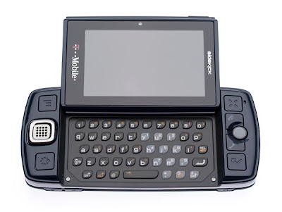
T-Mobile's Sidekick LX review

The Sidekick LX weighs in at a hefty 162g (5.7oz) and measures 130mm x 60mm x 17.9 mm (5" x 2.4" x 0.7"). It's no secret that this thing is big and heavy, however Sharp has reduced the size over previous models, especially with regards to the Sidekick's thickness. The build quality is solid, however, with no creaks. The main display swivels up with a very satisfying snap, though there is quite a bit of play throughout the opening motion. The Sidekick LX comes in either navy blue or deep brown, and though the front is a very smooth plastic, there are too many buttons for the handset to show fingerprints. The back is textured to look like leather, which I found to be a nice touch, and helpful for gripping.

The Sidekick LX has the most buttons of any phone I've held, not counting the internal QWERTY keyboard. There are a total of ten buttons with varying functions, not including the odd speaker/d-pad combo and trackball. The top edge of the device offers two buttons that appear to be softkeys. Their function seemed to be dedicated to the camera, though in some menus they were assigned new functions. On the bottom of the device is the volume rocker and power button. I found the volume rocker to be poorly placed, as I was constantly pressing it by accident with my thumb. The left end of the Sidekick LX offers the miniUSB port, used for both charging and data transfer, and the 3.5mm audio jack.

To the upper left of the main display is an options button, which drops down a sub-menu in each screen with additional options. At the lower left is the jump key, which is used to get back to the main menu. Between the options button and jump key is the speaker, which doubles as a secondary d-pad. The speaker/d-pad only supports up/down/left/right, and cannot be used to select things. It can also be disabled in the menus. The right side of the screen houses the cancel button, which has an appropriate 'X' symbol on it, and the done button, which sports a checkmark symbol. Between these buttons is the trackball, flanked by the end/send keys. The trackball is incredibly useful and has a very distinct 'click' to select. It is also incredibly functional, as it lights up with various status lights.

LG's Rumor QWERTY Phone for Sprint

LG's Rumor, offered by Sprint, is a nifty side slider that is aimed at folks wanting a phone geared towards text messaging. With this in mind, a full QWERTY keyboard is part of the package. In addition to advanced text messaging features, the Rumor has a 1.3 mega pixel camera, MP3 audio Player, and the usual assortment of software features. Sprint's EV-DO network is not supported, but with the focus on text communications, broadband internet is less of a priority.

Our test unit arrived in matte black, with a blue band dividing the face of the phone from the section housing the QWERTY keyboard and the battery. The black surfaces have a finish that feels good in the hand, sort of a rubberized silky texture which seems to hold up fairly well to everyday wear and tear. The matte finish seems impervious to fingerprints and no scratches were apparent after our time with the handset. You would be forgiven for mistaking the Rumor for a rather large candy bar phone, as that is exactly what it looks like when the QWERTY text messaging keyboard is retracted. Exterior dimensions add up to a slightly chunky 109.5mm x 63mm x 18mm (4.3" x 2.0"x 0.7") and it weighs in at 116g (4.1 ounces). The Rumor is a little larger than I would like, but quite honestly I didn't care because its slightly above average size and weight yield a nice chunk of extra usability.

As I previously mentioned, the phone is set out in the traditional candy bar format and as such has the usual array of numeric keys, soft keys below the display, and a D-pad. You also get dedicated speakerphone and "back" keys for speedy navigation. There are two more soft keys on the right side of the display which come into use when the QWERTY keyboard is extended and the display shifts into landscape mode. Additional buttons on the left side of the phone are the up and down volume keys and the shutter button for the camera, which is rather poorly placed.

The QWERTY keyboard slides out to the right and in doing so launches the phone into messaging mode, shifting the display orientation. The slide mechanism feels solid and springs open firmly. All the keys on the phone are nicely backlit. Those on the numeric keypad are illuminated in a vivid blue, while those on the QWERTY keyboard are thoughtfully done in white. This is important, as although the blue would look cool, it's also a bit tougher for the eye to focus on and therefore tends to be fatiguing.

Samsung Blast for T-Mobile USA review

Samsung's SGH-T729, AKA the Blast, is a stylish and slender slider phone that is being offered in the USA by T-Mobile. It appears that the emphasis here is meant to be on text messaging, based on a number of integrated instant messaging clients and the QWERTY-like layout of the Blast's 20 key keypad.

Our test unit of the Samsung Blast arrived in a two-tone finish. The front is matte black and the back side of the handset is a shiny metallic looking red. The red finish looks good, but I have my doubts about how well it will hold up to abuse, since our test unit already had a small gouge in it. It's worth noting, however, that there were no additional scratches at the end of our evaluation, and fingerprints were scarcely evident after handling. Altogether this adds up to a very nice looking package, especially with its slim 106mm x 52mm x 13mm (4.2" x 2.0" x 0.5") dimensions and its scant weight of 79.4g (2.8oz).

As with most sliders, the d-pad and a number of buttons surrounding it are just below the display while in the closed position. The typical green and red send and end buttons are prominent, with soft keys in the typical upper left and right positions. Two other dedicated keys are available: the left key is a shortcut to T-Mobile's T-Zones and the right key is a shortcut to the MP3 audio player. Directly below the D-pad is a correction key. The remaining exterior buttons include a volume rocker on the left edge and camera shutter key on the right edge. There is no dedicated speakerphone key, but the right softkey performs this function during a call. The speakerphone is loud, though not the clearest I've heard, but it is still very understandable.

This leads right into the sound quality on the Blast, which turned in a good result. No complaints from either end of a call. As for T-Mobile's GSM network, I experienced no dropped calls during my time with the Blast, it's internal antenna seeming quite up to the task. Talk time fell in line with the manufacturers reported 5 hours alongside its 8 days of standby time.

The slide mechanism operates smoothly, but unfortunately this also reveals the closest thing to a problem with the Blast. The chink in the Blast's armor is its 20 key keypad. I have to admit to not being a fan of QWERTY keyboards on phones in general, and I find this 20 key QWERTY-like layout to be no exception. On top of that, the keypad itself has poor tactile feedback, being one large rubber sheet with raised areas for the individual keys. Each key represent 2 letters of the alphabet at max. This certainly helps with T9 predictive text input, making it more accurate, and I'm sure that a person will get used to the layout after a period of time, but I found it more frustrating than either a full QWERTY key keyboard or a standard 12 keypad. The more annoying thing is when you have to enter a phone number that uses a word to make it easy to remember, such as 1-800-FAKE-NUM. With a 20 key layout like this, you either need to have the letters on a standard 12 key keypad memorized, or you'll find yourself looking for a normal phone in order to figure out the appropriate numbers. Granted this is probably not a frequent occurrence, but it happened to me during testing.

Measures have been taken to make the Blast a good messaging phone, and to that end a number of messaging clients have been included, namely AIM, Windows Live, ICQ, and Yahoo! instant messengers. For email, a number of webmail clients including AOL, Gmail, and Yahoo are supported. I read specs claiming that the Blast includes POP3 and IMAP support, but I didn't find a way to configure such accounts.

Samsung was first to include an MP3 player in a mobile phone with their uproar some years back, and the Blast doesn't disappoint in this department. The slick display upon activating the audio player gives a map to the d-pad's player controls. There are better audio player UIs on the market today, especially with Apple now on the scene, but the Blast is certainly passable, and available at a far more reasonable price. With an MP3 player onboard, the included support for stereo Bluetooth is certainly a welcome feature. Unfortunately, it appears that Bluetooth is the Blast's only option for stereo playback, as there is no conventional headphone adapter and the included wired headset has only a single earpiece.

T-Mobile's Shadow, a Smartphone for Novices

The T-Mobile Shadow, built by HTC, is the first Windows Mobile 6 device to sport Microsoft's new Neo home screen. Neo is an attempt at making the power of a smartphone accessible to novice users, users that have traditionally shied away from such devices because of its complexity. On top of that, the Shadow has a very compelling design, and offers messaging fans a new 20 key QWERTY-like keypad that should make the phone's XT9 predictive text input system both faster and more accurate. That's something that goes well with the Shadows built-in IM clients, email and SMS support, and large 2.6" display.

The T-Mobile Shadow is one of the few Windows Mobile devices on the market that makes use of the slider form factor. The design allows the Shadow to use a massive 2.6" main display while still having enough room left over for a full control cluster and a 20 key alphanumeric keypad. The Shadow isn't small, at 104mm x 52mm x 16mm (4.1" x 2.0" x .6"), but it is pretty light for its size: only 108g (3.8oz).

The display itself is a 65k color unit with QVGA (240x320 pixel) resolution. There is no brightness control, automatic or otherwise, on the Shadow, but it does have a power saving dim mode that it enters after a user configured number of seconds. After a second user configurable timeout, the display turns off completely. When the display is on, text is crisp and bright and very easy to read.

Beneath the display is the main control cluster. The controls include a pair of softkeys, a pair of larger home and back function keys, the red and green call keys, and the dual-mode d-pad that can also be rotated to act like a scroll wheel. The d-pad works very well for normal up/down/left/right navigation, and is passable for scrolling. My impression is that the scroll wheel works fine physically, but that the software support in certain sections of the phone is not calibrated well. Either way, it is very nice to have in certain situations. I also like that the center of the d-pad glows a soft green color for a short time when a new message arrives. A pair of small LEDs near the earpiece of the phone provides long term status information for new messages and charging.

The last major attraction on the Shadow is its 20 key hybrid keypad/keyboard. Looking very much like the SureType keyboard RIM developed for the Pearl 8100, the 20 keypad on the Shadow improves upon the accuracy of predictive systems like T9 without requiring the 50+ keys found on a traditional QWERTY keyboard. It has some issues, which I will talk about later, but in general it works very well for light messaging. The keys themselves are very large and stable, and offer nice, consistent tactile feedback. There is a bit of a problem with the backlight, though. The backlight for the keypad and the softkeys will sometimes turn off and not turn back on even if the d-pad is clicked or scrolled. This can be a real problem when using the device in the dark, as you have to hit a keypad button (that you can't really see) in order to get the backlight to turn back on.

The rest of the physical design of the Shadow is very nice, as well. While the gold-green color scheme of our review unit might not suit everybody, few will take issue with the build quality of the device or the nice soft-touch paint used on its back cover. Other controls on the Shadow include a volume rocker, a camera shutter button, and a user configurable shortcut key, which I used for messaging and voice dialing. A microSD memory card slot and the miniUSB power/data/headset port are also easily accessible on the left side of the phone, even though the attached covers seem to be a bit stubborn during removal. The 2 megapixel camera lens and speaker grille for the ringtones are located on the back of the device.

Apart from the sometimes slow scroll wheel response, I truly love the physical design of the Shadow. It is simple, comfortable to hold and use, and has elegant lines and curves.

Samsung Blackjack II for AT&T

The original Samsung SGH-i607 BlackJack was a great phone that was hampered by pretty poor battery life, like many of the thin QWERTY equipped smartphones of the past. In spite of that issue, the BlackJack was still a very popular cell phone for AT&T (then Cingular). This time around, Samsung has addressed the battery issue and added a few new goodies to the mix, like a d-pad that serves double duty as a scroll wheel. The resulting device is a millimeter or two bigger in height and width, and an extra 10g heavier, but those minor tradeoffs are well worth the results.

The new SGH-i617 features the same basic form factor and design as the original BlackJack. The phone's flat block shape tapers down at the bottom, giving the phone a pleasing look and an equally pleasing feel in the hand. The lines used by Samsung's designers are all very clean and soft, with the only exceptions being the squared corners on the buttons found in the d-pad control cluster beneath the display. New for the BlackJack II is the piano black glossy finish on the cover, which makes the phone something that any CSI investigator would love to find at a crime scene. It is worth noting that the wine red version has a textured back cover that doesn't show fingerprints, but it still has a glossy front cover.

The display on the BlackJack II has a 2.4" screen that can render 65,000 colors. This QVGA resolution screen is crisp and colorful, and can be set to any one of 5 brightness levels, all of which I found to be quite workable. It has an almost paper-like appearance to it that I just love. The aforementioned control keys and d-pad all work quite well and are attractively designed. The BlackJack II's d-pad scroll function works better than the one found on the T-Mobile Shadow that we recently reviewed, and proved itself to be quite useful. I do think that it would work even better if it had a more fingertip grabbing radial pattern on it instead of its concentric circles design, which doesn't provide enough grip for dry and cold wintertime fingers.

The d-pad isn't the only thing that lacks a bit of grip on the SGH-i617. The phone's otherwise stellar QWERTY keyboard's keys have the same glossy surface as the rest of the device, something that makes them a bit slick at times. The older BlackJack didn't have that problem, though it did suffer from a strange number key layout that has been fixed on the new model. The new BlackJack II also has a couple of additional shortcuts keys that I find quite handy. Overall, it is an exceedingly good keyboard, it just could have been a tad bit better if it had kept the old design's matte finish.

The remainder of the device is pretty simple. A nicely shaped volume rocker control is found at the top of the left edge of the phone, and the multi-purpose power/data/headset port is located directly beneath it. I would have preferred for this port to have been on the bottom of the device, though, as side-mounted headsets are a real problem in pockets. A power button is located on the top of the device, which I like since it also calls up the Quick List menu. A small multi-color status LED is located nearby. It provides information about charging and new events, like received messages. The right edge of the phone is bare except for the microSD slot, and the nicely sculpted back cover of the phone bulges out where the 2 megapixel camera is located. Otherwise, the rear cover is plain except for the subtle Samsung logo.

The Samsung SGH-i617 sports a near perfect design for a messaging smartphone. It weighs only 116g (4.1oz) and measures 114mm x 61mm x 13mm (4.5" x 2.4" x .5") in size, with an additional 2mm bulge for the camera. That's not bad at all. There are a few little snags, like the glossy surfaces, but overall it is one of the most elegant and practical QWERTY phone designs on the market.